Tuesday, May 10, 2016

Art Impressions Style Water Color Picture

I have been obsessed lately with the Art Impressions style of water coloring!  I am trying to use what I already have in my stash of stamps and markers to learn this style.  I figure I’ll save money by not investing in new things plus it will help me expand my skills.  It’s been slow going and somewhat frustrating, though, because most of what I’ve been creating ends up looking messy with very little detail.

My Stamping Friend is a great teacher and I am very thankful for her!  She looked at the pieces I created and immediately knew what I was doing wrong.  Too much water.  The key secret to this technique is that the brush needs to be almost dry.  That’s what stops the ink from running together and creating a blobby mess in the center of the image.

My Most Awesome Stamping Friend made her own catalog of her Art Impressions stamps (and other stamps that will work for this technique) and included card examples that she found online.  She had been making those types of cards for several years but stopped for a while.  She almost purged all that stuff but decided to make the catalog instead.  I am soooo glad that she did that!    
We got together last Saturday and worked on a few water color pieces after watching an Art Impressions instructional video that she has.  The image in the attached picture is the best of the three images that I painted.  I may still put one of the others in a frame or on a card, but for now, they are in the stack with the other images that I have made as practice pieces.

The watering can in my image is not an Art Impressions stamp, but it works nicely.  The flowers, leaves, and grass are Art Impressions stamps and came from the basic floral and grass sets.  We used Marvy Le Plume markers and a water pen to paint the image. 

The other key secret to this technique is the water color paper – use a GOOD quality paper!  Some less quality papers either warp when the water hits it and/or it sucks up the ink & doesn’t allow it to move. We used Strathmore 140 lb cold pressed water color paper, on the less toothy side. The ink moved nicely and blended well.

I created a frame using dies & popping it up  over the image. I think glued on a black backing piece that is slightly larger than the frame to finish the front. I then cut an easel with a Sizzix die and glued it on the back. So now my picture stands up.

Try the Art Impressions style of water coloring ... you may find that you love it!


Friday, May 6, 2016

Freckle Fish!


No card to share today ... I've been making a few cards here and there, but have actually been spending more time organizing my studio. I am still working on the "Jennifer McGuire" style of storing my dies and stamps.  It has been slow going ,,, but as we know, "slow and steady wins the race!"

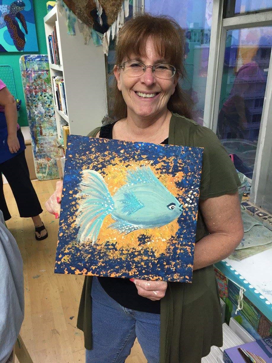
I went to Bali Studios  in  Cocoa Beach last night and painted this Freckle Fish!  Oh my, it was fun!  I forgot to put on an apron, so I got paint on my black top, but such is life.  If you look close, you can see the paint splatters on my arm!  lol

This painting is very easy and I will probably paint a few more at home.  It is three layers of sponged-on paint   (two of the orange/yellow background and one of the dark blue around the edges). Then, paint is splattered on top of that.  Next is the fish -- no stencil for that!  

Do you remember from your Kindergarten days how to draw a fish?  Where you draw the curved shape & add a triangle along the side?   Well, that's how you draw the fish, only using paint and a paintbrush.  Then fill it in with a base coat of white (I used creamy white).  While the base coat is still wet, blend in several colors of blue & one of a brown. Use the darker colors ar the bottom..  Paint in the eye, dot it up (freckles!), dry the piece, and you're done!

Tuesday, April 19, 2016

I'm Just a Wee Bit Late With This Post!


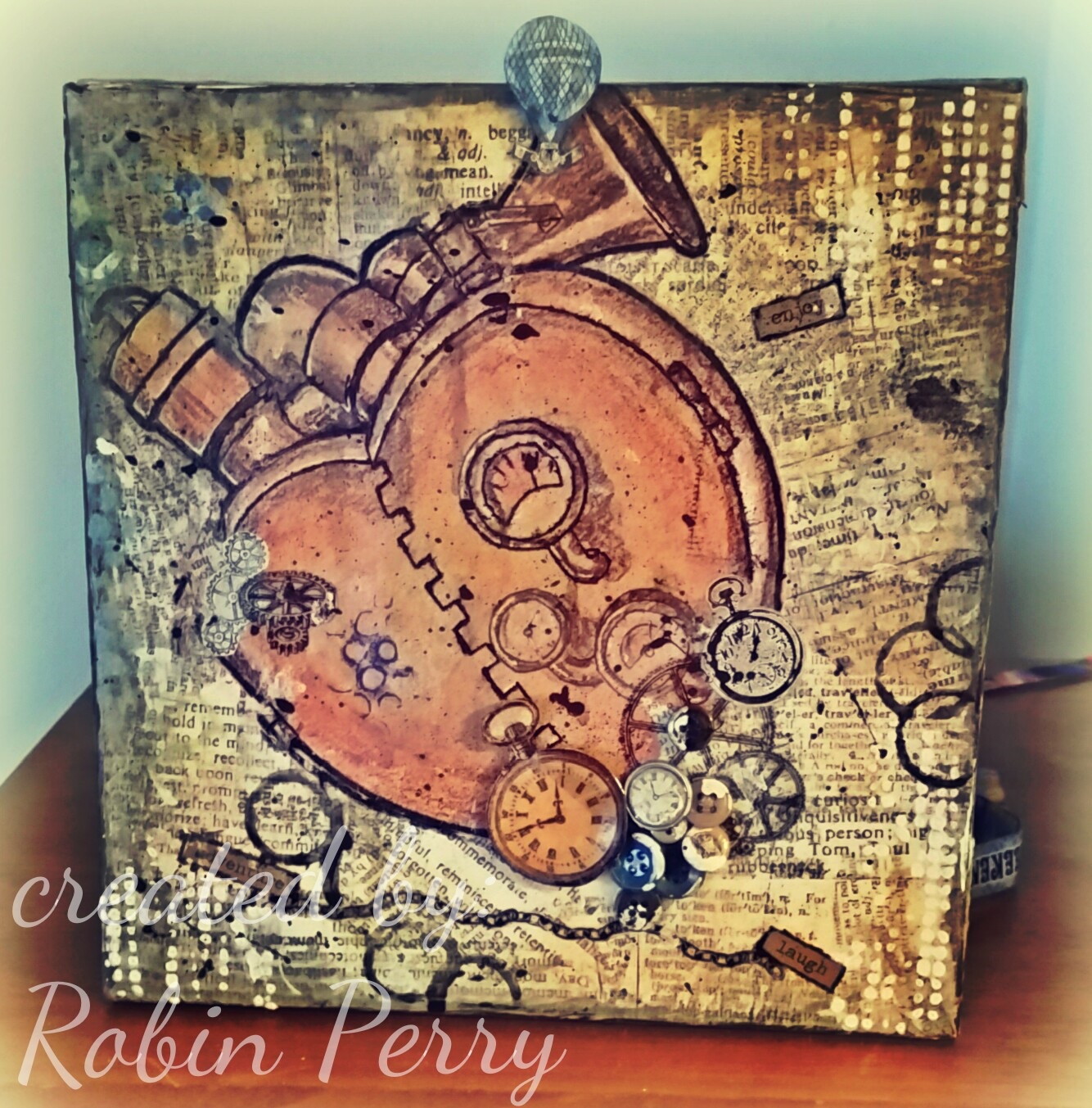
This is the Valentine's Day gift that I made for my Sweetheart.  He loved it!

I started the canvas at a mixed media class that I took at Bali Studios in Cocoa Beach, FL.  The owner, Sheri Stewart, is awesome!  She is an excellent artist, teacher, and friend!  If you have the opportunity to attend any of her classes, you should go! You will leave with a wonderful piece of art that you created.   Sheri can be found on Facebook at Bali Studios.

Anyway!   I printed  out  a free steampunk image (found here) and took it with me to the class. I also took a few other odds & ends that I found in my art studio that I thought might work.  The base of the canvas is torn scrapbook papers that are glued down with mod podge.  I cut out the steampunk image & glued it down on top of the scrapbook papers. I used the other "odds & ends" to decorate the canvas, then outlined the image with a black sharpie to give it more definition.

The pocket watch images were cut from scrapbook paper; the image on the left was covered with Glossy Accents from Stampin Up & glued on when it was dry. The cogs and chain at the bottom came from a sheet of rub-ons that I picked up at Tuesday Morning. The white dots were made by applying modeling past through a stencil.

This was a fun piece to make!

Tuesday, March 8, 2016

MMTPT398


This is my card for today's Teapot Tuesday challenge on Spltcoaststampers,com. This week, our cards are going out to Mrs, Utterback in Alderson, WV.  Mrs. Utterback will be celebrating her 103rd  birthday soon!

I apologize for the brevity of today's post ... I am going to type the recipe for rhe card and leave this post at that.

Recipe:

Cardstock - Fun Stamper's Journey
Ink - Stazon black, Memories sand
Stamps - Cornish Heritage Farms (poppy), Fiskars (jar & frame around sentiment), Verve (sentiment)
Accessories - woodgrain embossing folder, blue sharpie pen (water in jar), Prismacolor pencils, scrap piece of clear plastic packaging material

Wednesday, March 2, 2016

MMTPT397


This is my card for this week’s Teapot TuesdayChallenge.  This week, our cards are going out to a Sister-SCS’er, Cheryl (cherylquilts).  The theme of this week’s challenge is “threads, pins, needles, patches.”  I took some creative license and expanded that into quilting since, according to Cheryl’s username, she is a quilter.  

Since I am in the middle of reorganizing my art studio (and it is a disaster area right now!), I wanted to keep to a simple card that didn’t require dragging out a lot of supplies.  While cleaning out my paper scraps earlier this week, I ran across a 6x6 pad of Basic Gray “Out of Print” designer paper that I had forgotten about.  The flowered sheet is perfect for a quilted motif – all I had to do was emboss it with my We R Memory Keepers 3D embossing folder. The black border is also from the same Basic Gray paper pad, so of course, it coordinates perfectly with the flowered paper.     Easy Peasy!


I had strips of both papers left over, so I used a border punch along the black piece. I flipped the flowered piece over and stamped on the white side. (I apologize, but I do not know what company the stamp is from.) I then glued the two pieces together, trimmed them to size, used my clear glitter pen over the sentiment, and popped up the piece with 3M mounting tape.  I found the Lindy’s Stamp Gang brass butterfly charm while cleaning and had set it on my desk.  Turns out that it was perfect for this card so I used teensy pieces of 3M mounting tape on the back & attached it to the card.

The card base is Fun Stamper’s Journey white cardstock and I used Archival Black ink.

Wednesday, February 24, 2016

Butterfly card


This is a card from my stash; I am sending it out in response to a card drive request on Splitcoaststampers.com.  I don’t remember much of the details but I wanted to share it because I haven’t posted anything for a few days.

The butterfly is a Joy Craft die and is available from Frantic Stampers   .  The image is Carved Damask (Product # [AT-0075]) from Fun Stamper’s Journey; you can order this stamp through my FSJ website.  It was stamped then heat embossed.  The image was cut with Spellbinders Label One and matted with a decorative Labels One.  I do not know the brand of the designer paper or the name of the collection that it is from.

Friday, February 19, 2016

Masculine Thinking of You


This is definitely a Clean And Simple (CAS) card!  And it was fairly quick, too.  I “copied and shared everything”  (CASE) This Card found on Stamp & Create With Sabrina .  I love the elegance of her card and I also like that it can be used for other occasions.

I used Fun Stamper’s Journey  Butter Cream cardstock for the base and all layers, so this card is very heavy  (just how I like them!).  I didn’t measure the image panel, but it looks like it is about 3” x 4”.  If you are CASE’ing my card, you might want to cut it a little larger & then trim as necessary.  


 The image comes from Technique Tuesday’s Greenhouse set; it is dated 2012 so it might not be available any longer.  I used Momento cat’s eye pads in Olive Grove for the stems and Rich Cocoa for the pod.  The sentiment is from Stampin’ Up Wetlands set and I used Fun Stamper’s Journey Black Licorice ink for it.  I then used a clear glitter pen over the word “Thinking” only.

I used Stampin’ Up Square Lattice embossing folder for the embossed layer. It was cut at 4-1/8 x 5-3/8, embossed, then trimmed to fit the card with an even border.   I used a piece of fun foam to pop up the image layer.  The solid backing from the fun foam will insure that the card will go through the mail and not be crushed.  

Tuesday, February 16, 2016

Valentine's Day Card


This is the card that I made for my Sweetie.  I can finally post it on my blog now that Valentine’s Day is over!  He doesn’t read my blog, but I was afraid that if I posted the card early, that would be the one time that he did …. and then the surprise would be ruined.

Without further ado, here are the deets about this card.

The image panel (Fun Stamper’s Journey Oatmeal Cookie cardstock) is cut to 4-3/4” x 6-3/4” then stamped with Stampin’ Up! Gorgeous Grunge using brown, red, and gray inks to create the background.  The hearts were punched with three different sized punches from Stampin’ Up Cherry Cobbler, Fun Stampers Journey Oatmeal Cookie & Black Licorice cardstocks, and an unknown patterned designer paper. I also used a Sizzix embosslit for the smaller embossed hearts.  The banner was stamped with a Sizzix stamp then cut out with the matching die and the sentiment is from Stampin’ Up’s Teeny Tiny Wishes set.  The sentiment is actually straight, so I snipped the edges of the rubber & shaped it into an arch when I put it on the acrylic block.

I used ink to distress the edges of the hearts and used Fun Stamper’s Journey's  Journey Glaze on top of the smallest hearts to make them look like glass. The twine is from a roll that I picked up at a thrift shop several months ago, so I have no idea what the brand is!

After the main image panel was complete and the glaze was dry, I layered it on top of Fun Stamper’s Journey River Stone cardstock that was cut to 4-7/8” x 6-7/8”.  This panel was then glued onto a 5” x 7” card base using Fun Stamper’s Journey Whipped Cream cardstock.


Monday, February 15, 2016

White Pencil Highlighting


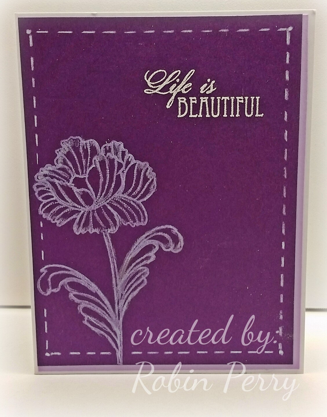
I have been wanting to try Jennifer McGuire’s White Pencil Highlighting technique  ever since watching her video from Feb 5th.    I needed a card for a friend’s mother, so I finally decided to try it last night.

My first attempt was not good at all, so it ended up in the trash.  It was so bad that I didn’t want to take a pic!  I used a floral background stamp, white pigment ink, and a white stabilo pencil; the details of the stamp got lost and it ended up looking like a mess of white lines.  Yuck!

I looked through my floral stamps and finally settled on an image from Penny Black’s Petal Party stamp set.  And! I was doing the Happy Dance after I found a white Prismacolor pencil in with all my other colored pencils!   I used Colorbox white pigment ink for the image and stamped it on the left side of the Fun Stamper’s Journey Pretty Pansy cardstock. I followed Jennifer’s instructions on using with the white pencil to feather and soften the ink. I liked this one sooo much better than the first one! 

I stamped one of the sentiments from the same stamp set with Versamark ink then heat embossed it with detail white embossing powder.  Then, I decided it was too stark and plain so I thought I would use Fun Stamper’s Journey Pretty Amethyst cardstock to layer underneath the image.   I decided to do something different and lay the front so that only the right side and bottom edges of the Pretty Amethyst cardstock was showing.

Oh. My Goodness!  This card is just not making me happy at this point.  I like CAS (clean and simple) cards, but this one was far too CAS.  It also almost ended up in the trash can!  Since this card really needed some help (and fast!), I figured that making a frame around it with the white pencil couldn’t hurt. 

Eureka!  THAT was what the card needed!  It makes me smile now, and I sure do hope it will put a smile on my friend’s mother, too!   

Tuesday, February 9, 2016

MMTPT394 Butterflies for Carolyn

https://www.pinterest.com/pin/24910604167734606/


This is my card for today’s  Teapot Tuesday  challenge at Splitcoaststampers.com.  This week, our cards are going out to Carolyn in Douglass, KY.

My card is a very loose CASE of  this card    that I found on Pinterest.  Since my card is very different, it is probably more accurate to say that I was inspired by Hansi's card rather than call mine a CASE (copy and share everything).  Oh well!

I used Papertrey Ink dies to cut the flourishes and Memory Box dies for the butterflies. The sentiment is from  Simon Says Stamps set  #SRHA15.  I used a clear glitter pen over the sentiment and the butterfly antennas.